
MCAN Unveils New Brand To Help Drive Progress Toward Access and Equity
At Michigan College Access Network, everything we do comes back to our broader purpose: to help students in Michigan access and attain college degrees and certificates so that they can achieve a lifetime of their own goals, both economically and intellectually.
As we neared our tenth year as an organization, we evaluated what would help MCAN truly move the needle toward expanding college access for all. We saw a need for messaging refinement; clarity in communication; and, most importantly, internal evaluation regarding our identity and intent as an organization. At our core, we knew that our organization was passionate about achieving equity, especially for low-income students, first-generation college-going students, and students of color. Though we work, speak, and breathe college access, that is because we know it is the most important conduit through which we can empower populations that are too often overlooked, build an educated workforce, and improve Michigan's economy as a whole.
It became clear that we were in need of a stronger set of tools to help facilitate our communication. Therefore, as articulated in our 2017-2021 Strategic Plan, we determined that a new brand was necessary to help set a foundation for MCAN's success and ultimately work toward equity and generational growth in Michigan.
MCAN’s initial brand was created ten years ago when our organization was first being incubated. To celebrate our tenth anniversary, MCAN's updated brand showcases our progress and priorities and allows us to swiftly communicate to all of our audiences—from legislators to grassroots advocates—why equitable access to college matters for our state. Today, we are proud to unveil MCAN's new brand, leading us into our next decade of facilitating bold, systemic change.
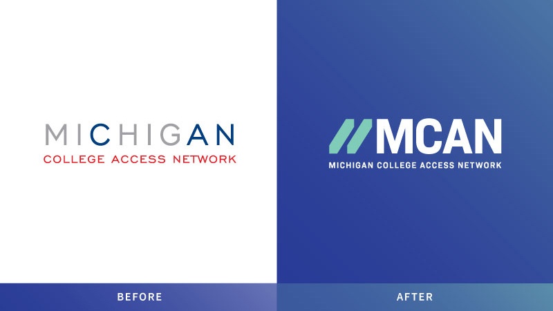
MCAN's new icon is derived from the concept of equity. The mark's skewed angle and squared ends represent how, while individuals may not start at the same point, ample access to tools and resources can help equalize opportunities for students in Michigan. Additionally, upward angles evoke forward progress and momentum. As a whole, our new visual aesthetic was strategically designed to feel polished, sharp, professional, and engaging. The use of bold, graphic shapes; sturdy, geometric type; and bright colors evoke energy and excitement, remaining polished yet progressive.
Though we have been refining this new brand for the past year, it is especially relevant today given the circumstances related to the COVID-19 pandemic. Much of today's news stems from a foundation of inequities—and for those of us in college access, our work is more important than ever. We must remain hard at work to provide equitable access to education, with a special focus on low-income students, first-generation college-going students, and students of color. A new brand and accessible website will help get us there.
A significant component of this transition is the launch of MCAN's new website. The website offers a more user-friendly, streamlined platform that clearly outlines MCAN’s offerings, strategies, and values, as well as our resources to support underrepresented students across Michigan. If you have questions on where to find anything on the updated website, let us know. We're here to help.
Since our founding nearly a decade ago, MCAN has emphasized that college is a necessary public good that is attainable by everyone. With everything we do and every change we make, we are working for equity through college access. In our next chapter, with an updated brand setting the tone, we will get there.